WEBJX收集25个漂亮的建设中的网站设计(3)
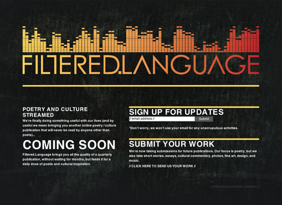
17. FILTERED.LANGUAGE
The logo has a techno look to it, which was why it drew me to the site in the first place. It turns out that it’s for a poetry publication. Regardless, the logo, which gives this "coming soon" page a nice dose of color, is spectacular.
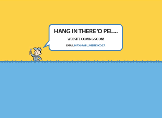
18. Johnny Walker Plumbing
I love how simple the look is, but you can still get the impression that he is a plumber at someone’s house fixing their flooded toilet or sink. It is simple but effective.
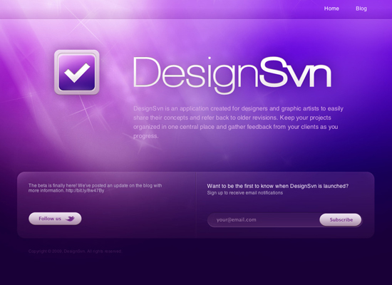
19. DesignSvn
I always love good Photoshop lighting work, and this website has it working really well with the web 2.0ish Twitter and subscribe icons.
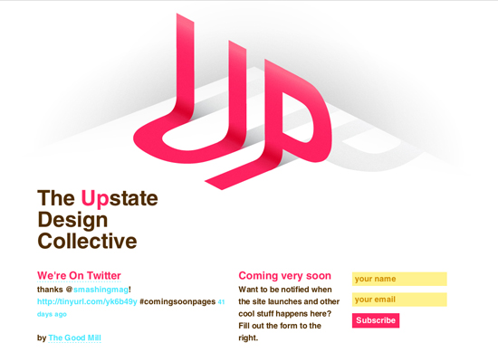
20. Upstate Design Collective
Other than the 3D effects, I really like how the bright fresh colors make the website stand out.
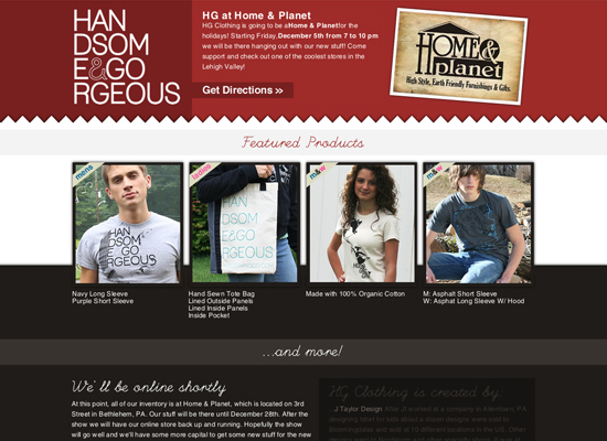
21. Handsome and Gorgeous Clothing
I think that it is important to showcase your merchandise, even if your website isn’t finished yet. I also like the use of the jagged edge, giving it a layered fabric feel, which is appropriate for what they are selling.
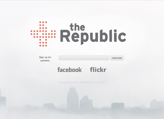
22. The Republic
I like the white design with the subtle cityscape at the bottom; it gives it an interesting look. I also like how they use gray colors instead of the typical black on white, which gives it a less harsh look and helps to make the logo mark stand out more.
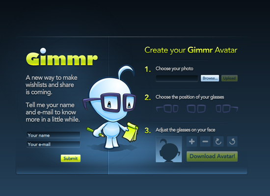
23. Gimmr
Not only does this "coming soon" page have a color scheme that I really like, it also has a unique feature. You can upload a photo of yourself and add glasses to your portrait so you can look like the character/mascot to the left (which you can then use as your avatar).
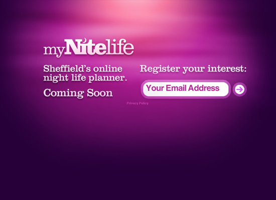
24. myNiteLife
This is another website that uses some nice lighting effects, and the purple colors give it a night feel that goes perfectly with their name (myNightlife).
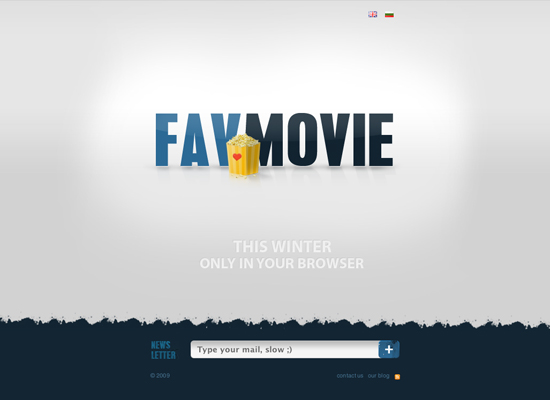
25. FavMovie!
It seems like they are using their "coming soon" page as more of a teaser, not really saying what they’re all about. All I can gather is that it has something to do with about movies (probably). If you want to find out, you can sign up for email updates.
