60个漂亮的有创意的关于我们网页页面设计(3)
Front and Center
Some designers have gone as far as making their about pages their home pages.
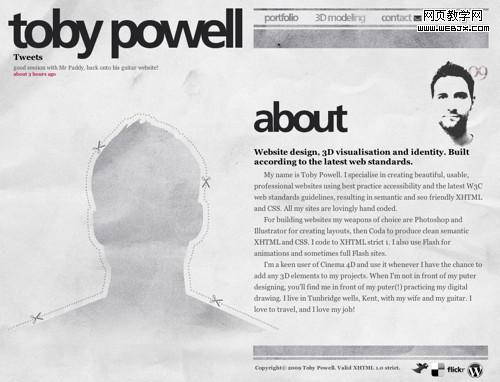
Toby’s about page is actually his home page, which for a personal website (and formal name as his domain name) is a great idea. After all, if we’re visitng Toby’s site for the first time it’d be nice to know who the designer is. He also flips the large portrait concept on its head by giving us a large silhouette where it’s supposed to be.
Jason Reed uses an excellent hand drawn illustration portrait as his about page centerpiece, and his about page in turn is his website’s centerpiece and the first thing you see when you land on jasonreedwebdesign.com. His professional details are neatly organized into a horizontal accordian and there’s no fluff - just the most important information one might want to know when considering Jason for a freelance project.
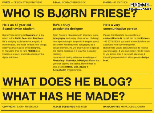
This website is hard to ignore not only because of its striking yellow background, but Bjørn’s organization of information.
Vlad has a very distinct goal in mind with his site and he accomplishes it with great typography and layout.
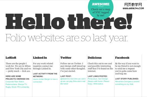
Kyle pokes fun at the traditional folio site with his one-page offering. You can easily find out all about him and his internet presence.


