��ʵ�õ���ҳ�������:����û�ϲ������ҳ����(2)
Tackling Usability Via Three Aspects Of Forms
ͨ������������������Ŀ���������
Despite differences in layout, functionality and purpose, all forms have three main aspects, as noted by Caroline Jarrett and Gerry Gaffney in their book Forms That Work: Designing Web Forms for Usability:
�����ڲ��֡����ܺ�Ŀ���ϸ��в�ͬ�����еı�������������Ҫ�ķ�������Caroline Jarrett��Gerry Gaffney�����ġ�Web������ƣ������߿����Ե���ҳ��������д��һ����
1. Relationship Forms establish a relationship between the user and the organization.
1.��ϵ���������û��빫˾֮�佨����ϵ��
2. Conversation They establish a dialogue between the user and the organization.
2.�Ի����������û��빫˾֮�佨���Ի���
3. Appearance By the way they look, they establish a relationship and a conversation.
3.���档ͨ����չ�ַ�ʽ�����������˹�ϵ�ͶԻ���
For a form to be usable, all three aspects need to be tackled. Let’s look at each aspect in turn to figure out how to make a form truly usable, along with practical guidelines that you can easily follow.
һ�����õı�������Ҫ������������������������������������Ҫ��һ����������������Ҫ��ѭ��Щָ�����룬������Ҳ���������֡�
Aspect 1: The Relationship
��һ���棺��ϵ
“No man is an island,” the 17th-century English poet, satirist, lawyer and priest John Donne once said. Indeed, human beings thrive on relationships, be they amorous, friendly, professional or business. A form is a means to establish or enhance a relationship between the user and the organization. When done badly, it can pre-empt or terminate such a relationship.
17���͵�Ӣ��ʫ�ˡ��������ҡ���ʦ����ʦԼ��•�����˵����û����һ���µ���ȷʵ�������ڹ�ϵ�гɳ�����������������ϵ���Ѻù�ϵ��ְҵ��ϵ���������ϵ�������ǽ�������ǿ�û��빫˾��ϵ��һ�ַ�ʽ��������ò��ã����ͻ��ս�˹�ϵ��
With this in mind, a number of principles emerge:
��Ȼ��ˣ����¹�����Զ����ˣ�
* Relationships are based on trust, so establishing trust in your form is critical. This can be achieved through the logo, imagery, color, typography and wording. The user will feel at ease knowing that the form comes from a sincere organization.
�� ��ϵҪ��������������ڱ����н�������������Ҫ������ͨ��logo��ͼ����ɫ������ʹ����������⡣���û�֪������������˾���Գ����ʱ�����Ǿͻ���ɾ��衣
* Every relationship has a goal, be it love and happiness in a romantic relationship or financial gain in a business relationship. Ask yourself, what is the goal of your form?
�� ÿһ�ֹ�ϵ����Ŀ����������ϵ��Ŀ���ǰ����Ҹ�����ҵ��ϵ��Ŀ���Dz�������������һ�£���ı���Ŀ����ڣ�
* Base the name of the form on its purpose. That name will inform users what the form is about and why they should fill it in.
�� ��������Ҫ�ܱ�������ͼ��������Ҫ��֪�û�������ʲô������ΪʲôҪ��д��
* Just as in a relationship, getting to know the other person is essential. Get to know your users and always consider whether the questions you’re asking are appropriate and, if so, whether they are timely. This will instill a natural flow to your form.
�� һ�ι�ϵ�У��˽�Է�����Ҫ��Ҫ�˽�����û���������˼���������ϵ���������ʽ���Ƿ��������λ�����Ƿ���ʡ���������˼���ı�����������Ȼ��˳����
* Knowing your users will also help you choose appropriate language and remove superfluous text. And it will help you craft an interface that balances your needs and the user’s.
�� �˽��û�������ѡ����ʵ����Ժ������������ͬ���а�������������Ľ��棬�������û��������������֮���ҵ�ƽ�⡣
* Do not ask questions beyond the scope of the form. In a relationship, you would become distrustful of someone who asked questions that were out of place. The same thing happens online. Consult with relevant stakeholders to see what information really is required.
�� ��Ҫ�ʱ�����Χ�����������һ�ι�ϵ��ʻ�����ʱ�˵��˻�����Ρ�������Ȼ������عɶ��������¾�����Ҫ��Щ��Ϣ�ɡ�
* Sudden changes in behavior or appearance will make users edgy. Likewise, never introduce sudden changes between forms or between steps in a form.
�� ���ܻ�����ͻ������û������ʴ���ͬ���ģ�������֮�����һ�������ļ�������֮�䣬���Բ�����ͻ�䡣

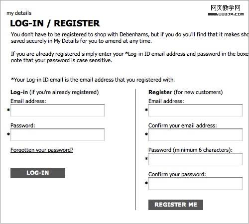
Know your users. Make it easy for registered users to log in and for new users to register. Debenhams makes this distinction barely noticeable.
�˽�����û�����ע���û���¼�������û���ע�ᡣ��Debenhams��վ�ϣ������ֱ�������û������

Amazon, on the other hand, simplifies the process for registered and new customers.
��һ���棬����ѷ�ı�����ע���û������û��϶�Ϊһ�ˡ�
Aspect 2: The Conversation
�ڶ����棺�Ի�
A form is a conversation. And like a conversation, it represents two-way communication between two parties, in this case, the user and the organization. In fact, the user has filled out the form in order to initiate communication with the organization.
�������Ի����Ի�����������������������е�˫�����û��빫˾��ʵ���ϣ��û���д��������Ϊ���빫˾������
For instance, with a social network, a user would fill out a registration form to inform the organization that they would like to join. In inviting their request (whether automatically or manually), the organization would ask the user a number of questions (in the form of labels), such as their first name, last name, email address and so forth. Upon acceptance (or denial), the company would inform the user of the outcome, thus completing the communication process.
���磬�罻��վ�У��û�ͨ����дע����������߹�˾����Ը����롣�ڽ����û�����ʱ���������Զ������ֶ��ģ�����˾�ᣨ�Ա�ǩ����ʽ�����û�һϵ�����⣬�����ϡ����֡����ʵ�ַ�ȡ�һ���û����������ܾ�������˾�ͻᷴ���������ɶԻ�ȫ���̡�
Viewing forms from this perspective yields some useful guidelines:
���������ⷽ��ó���һЩʵ��ָ�ϣ�
* As mentioned, a form is a conversation, not an interrogation. Aggressive wording in labels will make users feel edgy, and (if they do not leave) they will most likely give you the answers that you want to hear, rather than the truth.
�� ǰ���Ѿ��ᵽ�������ǶԻ����������ʻ���ǿ�Ƶ���������û����Խ��ܣ���ˣ���������Dz��ʹ��뿪�Ļ������ǻ����һ������Ҫ�Ĵ𰸣����������ǵ���ʵ���ܡ�
* Order the labels logically, reflecting the natural flow of a conversation. For example, wouldn’t it be weird to ask someone their name only after having asked a number of other questions? More involved questions should come towards the end of the form.
�� ��ǩ������Ҫ��������Ҫ�ܷ�ӳ�Ի������̡����磬���ʱ���һ��ѵ����⣬Ȼ����������������������������ض�Խ�ߵ�����ԽӦ��Ҫ�ŵ������ʡ�
* Group related information, such as personal details. The flow from one set of questions to the next will better resemble a conversation.
�� ����ͬ����Ϣ��������˽��ܿɹ�Ϊһ�ࡣ�õĶԻ�����һ�������һ��������ɵġ�

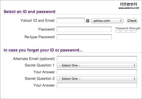
Yahoo’s registration form effectively groups related content through purple headings and fine lines.
�Ż���ע�����ͨ����ɫ�����ϸ�߰������Ϣ��������Ч�Ĺ��ࡣ

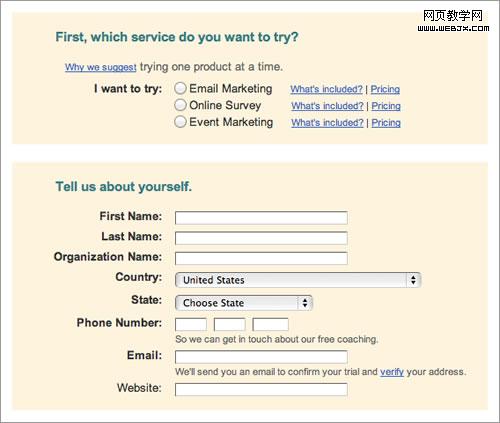
While Constant Contact groups related content, it separates the groups too much, which could confuse the user.
Constant Contact�����̫���ˣ����������û�����ġ�
* As in a real conversation, each label should address one topic at a time, helping the user to respond in the corresponding input field.
�� ����ʵ�Ի�һ����ÿ����ǩÿ��ֻӦͻ��һ���������������ܰ����û�����Ӧ��������������Ӧ��
* The natural pauses in a conversation will indicate where to introduce white space, how to group labels and whether to break the form up over multiple pages.
�� �Ի��л�����Ȼ��ͣ���������������ΪӦ�����������ף���ι����ǩ���Լ��Ƿ��ҳ��
* In any conversation, people get distracted by background noise. So, remove clutter such as banners and unnecessary navigation that might distract users from filling out the form.
�� �κζԻ������Ƕ��������������ġ���ˣ�ȥ������banner�Ͳ���Ҫ�ĵ���֮���������Ϣ���������û����ġ�

Dropbox provides a fine example of what a registration form should look like. The white space is effective, and the page uncluttered.
Dropbox��ע���������ģ�����������ˣ�ҳ���ࡣ