��ʵ�õ���ҳ�������:����û�ϲ������ҳ����(3)
Aspect 3: The Appearance
�������棺����
The appearance or user interface (UI) is central to the usability of a Web form, and there are several guidelines for this. To simplify the discussion, let’s group them into the six components presented earlier.
�������UI����web�����Ŀ����Լ�Ϊ��Ҫ��Ϊ���г�����ָ�ϡ������������ǽ��䰴��ǰ��˵���������ֽ����˹��ࡣ
1. Labels
1.��ǩ
* Individual words vs. sentences If the purpose of a label is simple to understand, such as to ask for a name or telephone number, then a word or two should suffice. But a phrase or sentence might be necessary to eliminate ambiguity.
�� ���ʻ�����������ǩ�������⣬����ѯ��������绰���룬һ���������ʾ����ӡ����Ǵ������Ӹ���ȷ������

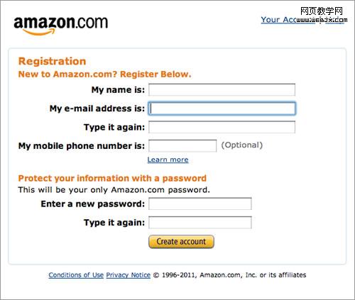
Amazon’s registration form contains full sentences, whereas individual words would have sufficed.
����ѷ��ע������õ�ȫ�Ǿ��ӣ�������Щ�ط�����������ܸ㶨��
* Sentence case vs. title case Should it be “Name and Surname” or “Name and surname”? Sentence case is slightly easier — and thus faster — to follow grammatically than title case. One thing is for sure: never use all caps, or else the form would look unprofessional and be difficult to scan.
�� ������ʽ�������ʽ������“Name and Surname” ������ “Name and surname”��������ʽ����Ƕȱȱ�������ף�Ҳ���죩���⡣����һ��Ҫ��ȷ��һ����Ҫ�ô�д����Ȼ�����ῴ������רҵ�������Ķ���

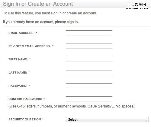
See how difficult it is to quickly scan the labels in Barnes & Noble’s registration form?
Ҫ�������Barnes & Noble��ע��������ж��Ѱ���
* Colons at the end of labels UI guidelines for some desktop applications and operating systems such as Windows recommend adding colons at the end of form labels. Some designers of online forms adhere to this, primarily because old screen readers mostly rely on the colon symbol to indicate a label. Modern screen readers rely on mark-up (specifically, the label tag). Otherwise, the colon is a matter of preference and neither enhances nor detracts from the form’s usability, as long as the style is consistent.
�� ��ǩ�����ð����һЩ������������Windows֮��IJ���ϵͳ�����ڱ�����ǩ�����ð�š�һЩweb���������ʦҲ�ŷ������Ҫ����Ϊ�ϵ���Ļ�Ķ�������ä��ʹ�õ�һ�ֹ��ߣ�������ð���������ǩ�����µ���Ļ�Ķ��������ݱ�ʾ�������DZ�ǩtag����Ҳ����˵��ð�ŵĴ��ڣ��Ȳ�����ǿҲ������������Ŀ����ԣ�ֻҪ��ʽͳһ�����ˡ�
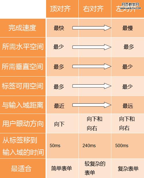
* Alignment of labels: top vs. left vs. right Contrary to common advice, above the input field is not always the most usable location for a label. It’s ideal if you want users to fill in the form as fast as possible. But there are times when you’ll want to deliberately slow them down, so that they notice and read the labels attentively. Also, keeping a long form to a single column and making users scroll down the page is better than breaking it up into columns in an attempt to keep everything “above the fold.” Each style of alignment has its advantages and disadvantages:
�� ��ǩ�Ķ��룺�϶��롢����뻹���Ҷ�������һ��Ľ����෴���������Ϸ��������Ƿ��ñ�ǩ�����λ�á���������û��������������������������õġ�����ʱΪ�����û��Ķ���ǩ���������������������������У��ѳ�������һҳ��ʾ�����û�����ҳ�棬Ҫ�ȷֳɼ�ҳ��ÿҳֻ��һ����Ч���á�ÿһ�ֵĶ��뷽ʽ���������ס�

*Times retrieved from “Label Placement in Forms” by Matteo Penzo.
��Matteo Penzo�ġ�������ǩ�ķ�������ȡ�����ݡ�

Forms should never consist of more than one column. Notice how easy it is to ignore the column on the right here on Makeup Geek (not to mention the note about “Required fields” at the bottom).
�������Բ��ֶܷ�����ʾ������Makeup Geek������������У������ױ����Ե�������˵�ײ���“������”�����ˣ���
2. Input Fields
2.������
* Type of input field Provide the appropriate type of input field based on what is being requested. Each type of input field has its own characteristics, which users are accustomed to. For instance, use radio buttons if only one option of several is permitted, and check boxes if multiple choices are allowed.
�� ������������Ҫ������Ҫѡ����ʵ����������͡�ÿ����������һЩ�û�ϰ��Ϊ�������ԡ����磬���ֻ��ѡ��һ�������õ�ѡ��ť��������Զ�ѡ���ø�ѡ��
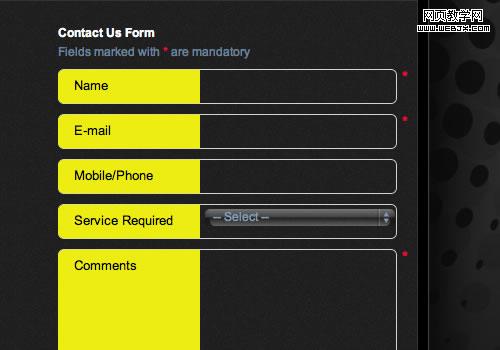
* Customizing input fields Do not invent new types of input fields. This was common in the early days of Flash websites, and it seems to be making a comeback; I have seen some odd input fields implemented with jQuery. Simple is often the most useful. Keep input fields as close to their unaltered HTML rendering as possible.
�� ��������������Ҫ�����µ����������͡������ڵ�flash��վ����ܳ����������ƺ����лع�ļ����ҿ�����һЩ���õ�ʹ��jQuery����������ʵ�á�������������������HTML��չ�ֵ�һ������

Altering the interface of input fields will confuse users.
�ı�������Ľ�������û�����
* Restricting the format of input fields If you need to restrict the format of data inputted by users, then at least do so in a way that won’t irritate users. For example, instead of displaying MM/DD/YYYY next to a text field for a date, consider using three drop-down fields or, better yet, a calendar control.
�� ����������ĸ�ʽ��������ò������û��������ݵĸ�ʽ����ôһ��Ҫ��һ�ֲ���ŭ�û��ķ��������磬�������ı���+“MM/DD/YYYY”��ǩ����ʾ���ڣ�������������������߸����ʵ������ؼ������档
* Mandatory vs. optional fields Clearly distinguish which input fields cannot be left blank by the user. The convention is to use an asterisk (*). Any symbol will do, as long as a legend is visible to indicate what it means (even if it’s an asterisk).
�� �����ѡ����Ҫ���û������֪����Щ�����������ա�һ�㶼��*�ű�ʾ�����������Ҳ�����ã�ֻҪ�ܿ���������˵���ͺã���ʹ��*��Ҫ��˵������