30个新鲜的个性化创意鲜明的网站设计实例
这可能是经济放缓,气候变化,甚至是随机提高创造力,但之间的竞争,是巨大的图形工作室现在。今天,比以往任何时候都,你真的需要一些特别的展示您的网站上被发现。因此,我们作出了选择30组合描述工作室或自由了一个独特的个性。请注意,您当然需要超过一个不错的“看” ,使设计脱颖而出,尤其是可用性和无障碍的问题,需要认真考虑当您建立未来的投资组合设计。
基于FLASH的设计
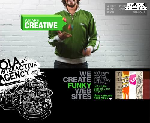
Ola Interactive Agency
A fun and straightforward website, with small videos running in the back to illustrate some of the company values, like creativity, speed and coolness! There’s a speaker on the left to kill the music.
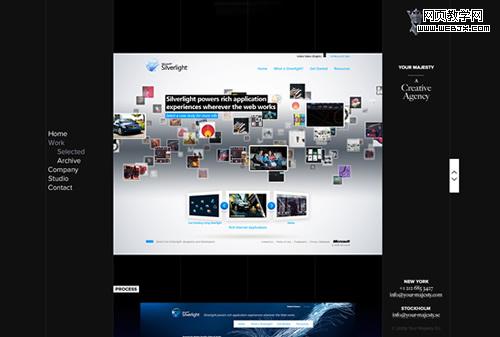
Your Majesty
Nice and clean website with more than one way to explore the portfolio, excellent branding, and a smooth dark color scheme.
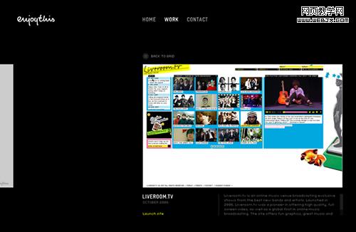
EnjoyThis
The minimal design and a sleek touch of Flash are the strong points of this one. Browsing trough the works seems so natural.
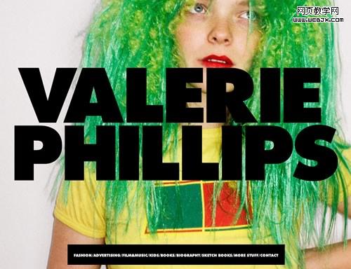
Valerie Phillips
This is huge. Literally!
Ben Thomas
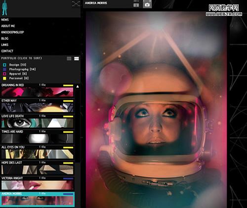
A simple and effective left aligned website, with a stylish motion effect that works great with the dynamic visuals in the portfolio.
Studio Output
This one is for the average portfolio what Vimeo is for YouTube: a minimal yet powerful alternative, an almost buttonless experience.
Lyndon Wade
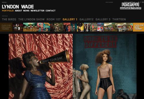
A classic dark styled background with a thumbnail menu and awesome transition effects are all you need for a killer portfolio. Oh, and some pictures from one of the top 15 photographers in America.
Cardon Design
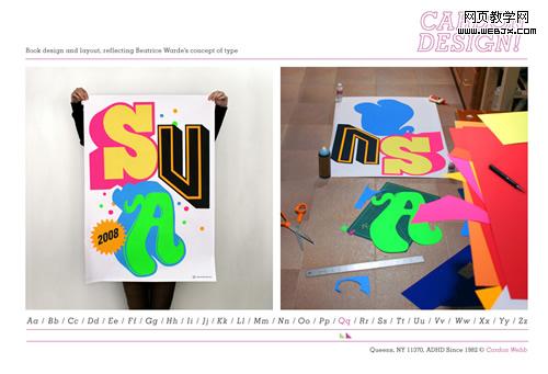
A simple and innovative way to show the portfolio, in a dictionary way. Great works also!
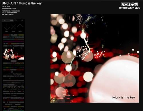
Kenjiro Harigai
One of the most complex websites in our selection, it features a visual menu with a lens effect, a text menu with the names of the works, and some amazing motion effects.
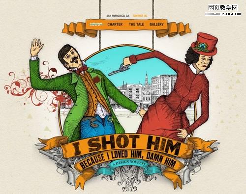
I Shot Him
This one is all about the story: with just a few vintage illustrations and some creative lines they really deliver "a design novelty".
