30个新鲜的个性化创意鲜明的网站设计实例(3)
Special elements
Portfolios that use at least one remarkable element (widget, color scheme, game) to create an immersive adventure.
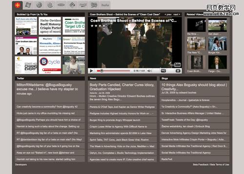
Crispin Porter + Boguski
Basically this website aggregates a YouTube video for a given campaign, the live news feed about it, Twitter bits, and blog pieces. It sure is the most social-ready portfolio of the selection.
Great Works
An excellent example of three colors website: sleek, smooth, and effective!
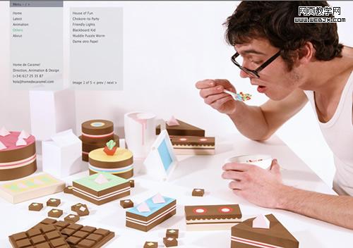
Home de Caramel
Another fullscreener, Home de Caramel features a double menu, just a few words and huge images. Makes sense.
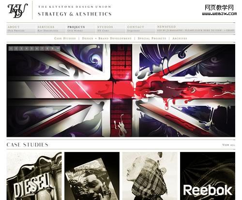
Trust The KDU
The vintage design and the sepia tone of the photos work extremely well together and make a great portfolio.
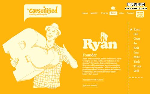
Carsonified
Strong colors and striking, simple illustrations make from the new Carsonified website an instant classic.
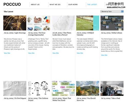
Poccuo
Very clean and dynamic website with a powerful Twitter integration and a nice simple way to show the creative work.
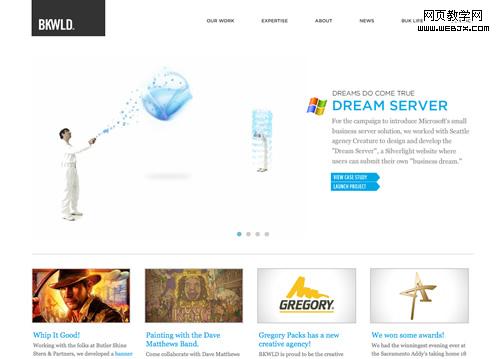
BKWLD
Clean design + Good navigation + Great works = Winner Portfolio
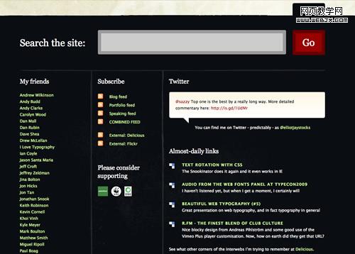
Elliot Jay Stocks
Another classic, the portfolio of Elliot teaches us the importance of a huge footer, actually as big as the body. Break the barriers, think big!
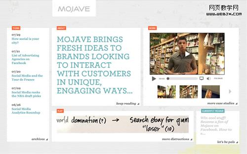
Mojave Interactive
Social media is very important business for Mojave, so they have compiled a few different channels in the homepage.
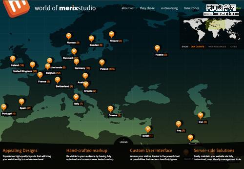
Merix Studio
Full intreactivity map with clients and resources, amazing idea!
