30个新鲜的个性化创意鲜明的网站设计实例(2)
Unique browsing system
Websites that let you scan the portfolio trough original and fresh techniques.
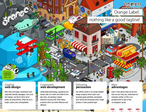
Orange Label
This is a one-page journey, a dive in the studio’s achievements, beginning with a strong graphic & profile, then some works and finally a feedback form.
Counter Fill
Exploring this portfolio is like falling from the roof of a tall building and stopping by a few times to look on the window. Click to see why.
X3 Studios
The excellent use of AJAX makes browsing this website such a smooth experience that you get the feeling you never left the homepage. Which is true!
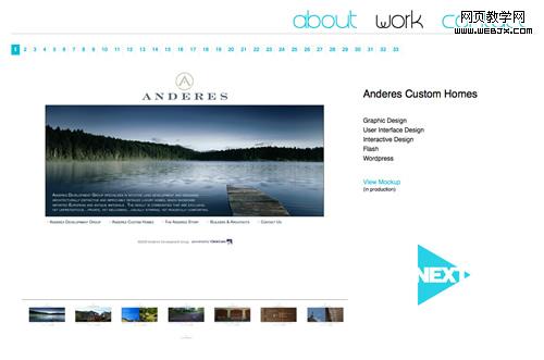
Lucas Hirata
Very good use of thumbnails and light.
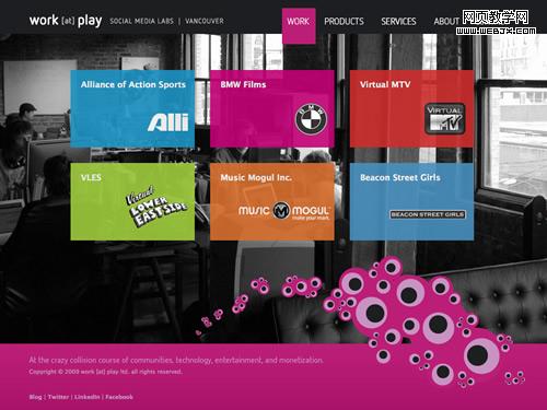
Work at Play
Maybe the most dynamic non-Flash website of the selection. Great uses of colors, transparency and AJAX.
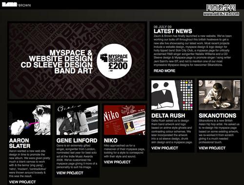
Zaum & Brown
Finally a grid based portfolio with a fluid layout. Don’t know if Brown comes from the color of the background, but that certainly works well also.
Creative People
The background is so important here! This amazing photo manipulation steals the show but introduce us properly in the studio atmosphere.
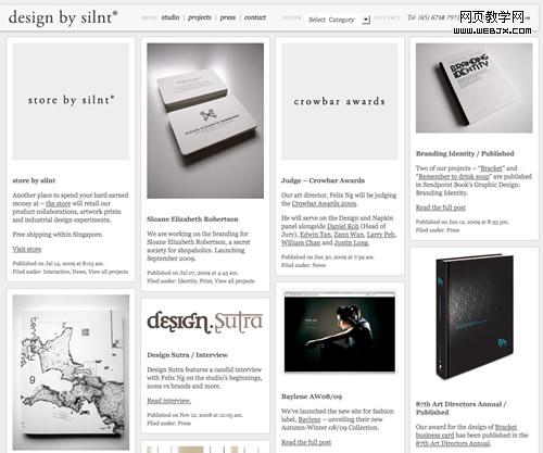
Design by Slint
This prolific studio from Singapore also has a grid-based fluid portfolio, where they show the works in a blog style way.
Dave Hill
The best proof that great photography doesn’t really need sophisticated design to stand out. Elegant and smooth.
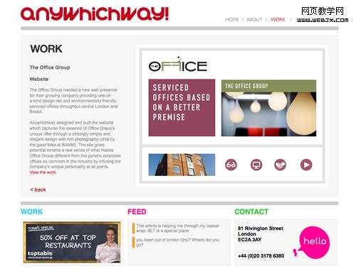
Any Which Way
Nothing fancy seems to be happening here at the first sight, but this website has a great navigation system: a mirror-like menu that stands as a fantastic alternative for the way over-used "carousel".
