设计实例:用字体变化设计的logo实例
今天带来用字体的变化设计的logo,这个趋势已经有很长一段时间了,字体本身就具有简洁,易读的特性,用字体的变化来设计logo方法包括:改变颜色,大小,留白,间距,变形,透视,再次排版,加辅助图案,合并字体,字体局部形象化等等,这里我们挑选出72个此类logo,和大家一起欣赏学习!
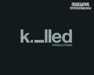
1. Killed Productions
Who killed letter i?
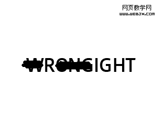
2. Wrong / Right
Really smart logo!
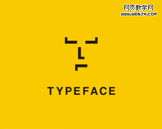
3. TypeFACE
Typeface: word-play: face from the type and letter T.
4. Galeria 291
Just loving this logo, great stylization!
5. Twins
Very popular logo already, but thought I still share it in typography section.
Author’s comment: “Logo was made for a bold creative team consisting of two people. Two people being brothers …and fortunately born on the same day. TWINS was a suitable name for the two. To reflect the essence of the duo, a bold typeface was created to reflect the boldness of their approaches. The number 2 was integrated to show the creativeness of their ideas.”
6. TicToc Clocks
Just smart logo, which ring the bell!
7. Gizzy bear
Author’s comment: “Gizzy bear is how a little kid might say grizzly bear. Mark is a lower case g bear and paw.”
Just genious!
8. Artists United
Simple, artistic and very clever – all in one place!

9. Sticky
Very good logo – yes, sticky!
10. Snap
Oh, snap – logo with very clear message.
11. Shift
12. Time watch
Very obvious concept – great idea!
13. Upside down productions
Each letter form is either another letter or itself flipped upside down… (umop episdn)
14. M1llion
15. Fuel Fitness
Logo designed for a fitness trainer. Looks like a shoe lice presented in good way.
16. Logotomy version2
17. Microgreen
Author’s comment: “G — microscope + green = microgreen”.
18. Review Code
Author’s comment: “Concept for a consulting company”. Creative and reads very well too!
19. Looks of love
Logo for woman underwear store – I think very appropriate and elegant logo!
20. Brand
