设计实例:用字体变化设计的logo实例(2)
http://www.itjxue.com 2015-08-07 21:59 来源:未知 点击次数:
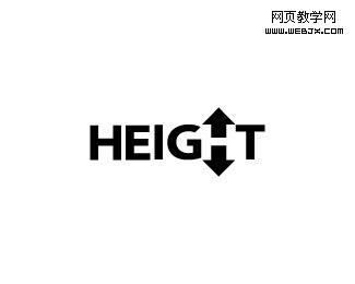
21. Height
Smart way to display Height and letter H.
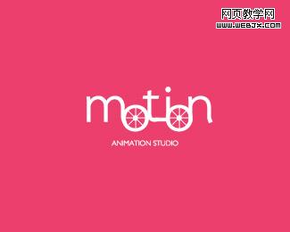
22. Motion
Creative dynamic logo looking like some kind of mechanism.
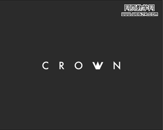
23. Crown
Simple, clean yet strong mark that could be used for almost all business.
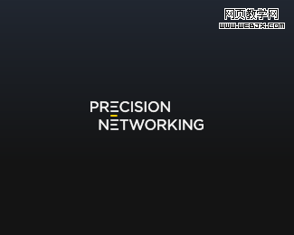
24. Precision Networking
Precision in logotype, stylized E letters and beautiful outcome!
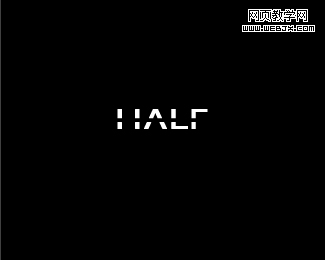
25. HALF
Did you know how half of letters can be displayed and separated just by stylized straight, invisible line? Real beauty.
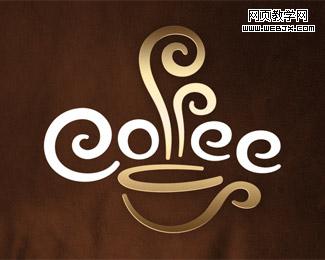
26. Coffee Cup
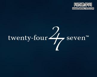
27. Twenty-four Seven
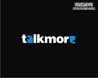
28. TalkMore
Already classic and famous logotype with smart little accents.
29. Invizio
30. HIGHROAD
How high? Smart perspective logo with depth.
31. UP
Progressive logo, I really like it!
32. EXiT
Find exit -subtle, smart accent in letter i dot, excellent logo!
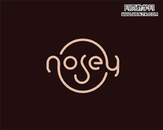
33. Nosey
Type Nosey and see human face at the same time! Very inspiring!
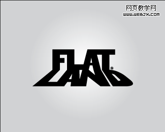
34. FLAT LAND
Midwest core-clothing company – typography with obvious meaning.
(责任编辑:IT教学网)
下一篇:设计理论杂谈:设计师的耐性