设计实例:用字体变化设计的logo实例(4)
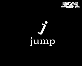
51. Jump
Do you see jumping guy in letter J?
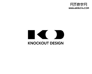
52. KnockOut Design
3 letters(KOD) demonstrated in logo again using positive, negative spaces.
53. BEND
This logo really invite to take a sit!
54. GSK Models
55. FuturEarth
Smart two letter connection!
56. ZIP
You really should have seen this one, but still thought to include!
57. Juicy
Logo for club night.
58. Kooture
Author’s comment: “This is being developed for a company in the fashion clothing industry. Client wants the new logotype for Kooture to be fresh, youthful, quirky and assured chic.”
59. Spirit
Stylish and clear logotype!
60. LogoReview
61. Michael Jin Photography
62. HATERS
63. 24/7 Pizza
64. Smokin Brands
65. KnowIT
Simple but catchy!
66. 365 Design
Look carefully at this one!
67. Ripple
68. SEOlution.it
Author’s comment: “Seolution.it is a new brand for a seo company. The idea of this brand/logo is combination of SEO+solution. For this reason “e” + “o” in the logo are combined to form a unique letter.”
69. GreatWorx
Logo for a software and systems consultancy.
70. Parnell Dickinson
Author’s comment: “Logo for partner brokers in the livestock business. They wanted a “not so western” look and more conservative and corporate feel.”
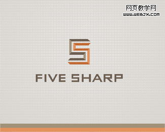
71. Five Sharp
72. Network Expertise
