设计实例:用字体变化设计的logo实例(3)
35. Trust
Heavenly trust, the letters a mirrored sort of an ambigram.
36. Trust v2
Exactly opposite logo from same artist with very interesting typographic play in devil’s face.
37. ABC
Very good stylization in letters with just typography.
38. Winery
Surprisingly easy to read and eye-catching logotype!
39. Ty wood
Author’s comment: “Proposal for a photographer specialized in wedding photography”. Many circles are used in design, again surprisingly easy to read showing designer’s professionalism.
40. Kadoo
One letter stylization and professional font with good spacing can really make difference.
41. Rinke
Interesting 3D logo, though I don’t understand why letter K is accented.
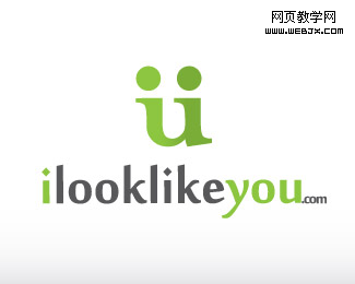
42. I look Like You
Loving and sharing, simple and smart logo.
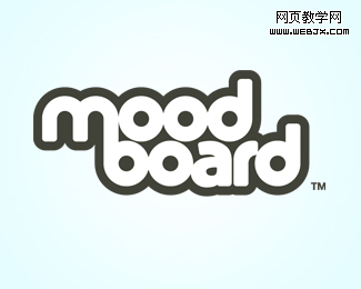
43. Moodboard
Modern, tasty logo and letter M and B uniting done in good way, a lot of circles and roundups!
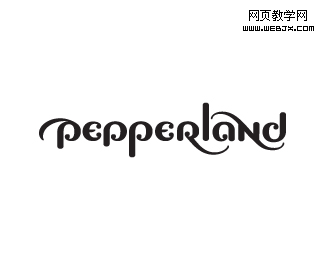
44. Pepperland
How many peppers you see in this logo?
45. Jive Software
Really eye-catching!

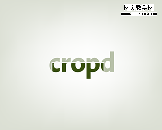
46. Cropd
A little bit cropped logotype for photo editing and sharing web site.
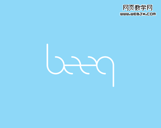
47. Beeq
Interesting typography, reads the same when rotated.
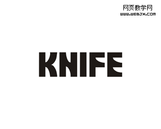
48. KNIFE
Very sharp logotype!
49. Forty 7 Studios
Interesting logo, where 4 and 7 read nicely, but if you look closer you’ll also note “S” in negative space! Really smart!

50. Love Logo Designs
Do you see all the letters? Smart play with positive, negative spaces.
